
Google has changed a lot over the past 17 years—from the range of our products to the evolution of their look and feel. Once again Google has announced it is changing its new logo, and has already launched it on its main search page.
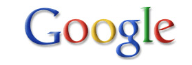
The Google Logo History


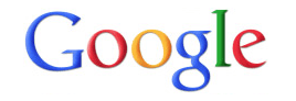
And The New One
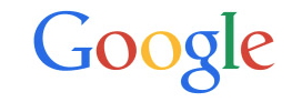
![]()
THE NEW LOGO IS MEANT TO REFLECT THE NEW WAYS PEOPLE VISIT GOOGLE
So why did Google decide to make the change? In a blog post, Google said,” Once upon a time, Google was one destination that you reached from one device: a desktop PC. These days, people interact with Google products across many different platforms, apps and devices—sometimes all in a single day. You expect Google to help you whenever and wherever you need it, whether it’s on your mobile phone, TV, watch, the dashboard in your car, and yes, even a desktop! Today we’re introducing a new logo and identity family that reflects this reality and shows you when the Google magic is working for you, even on the tiniest screens. ”
The new, simpler lettering Google logo is more distinct and easier to read. It’s also supposed to be easier for Google to display on low-bandwidth connections: Google says that it’s made a version of its logo that’s “only 305 bytes, compared to our existing logo at ~14,000 bytes.”
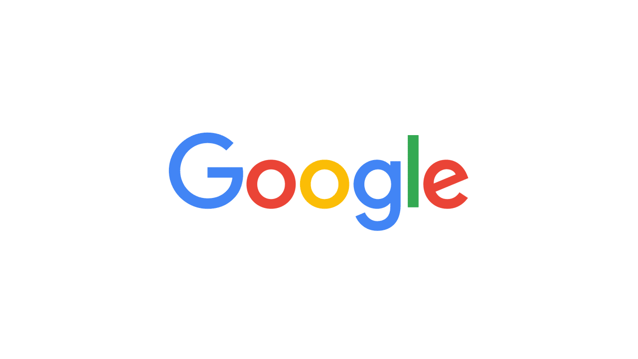
The little blue “g” icon is also out, and is being replaced with a four-colour “G” that matches the new logo. The four dots seen in the animation, representing what Google is ‘listening, thinking, replying, incomprehension, and confirmation’.
Google Introduces New Logo:
Google’s search page View
![]()
~ Google ’s look, evolved ~


